Role: student UX designer responsible for concept, research, wireframes, and prototypes
Duration: October 2020 through January 2022
Project Vision
toursome is a mobile app with audio calls, text messaging, and downloadable maps that connects tourists with a remote guide—from architects to art historians and anthropologists—to give users one-of-a-kind live tours at their convenience and at affordable prices.
Features
Search: Allow users to search for tours or guides based on desired criteria
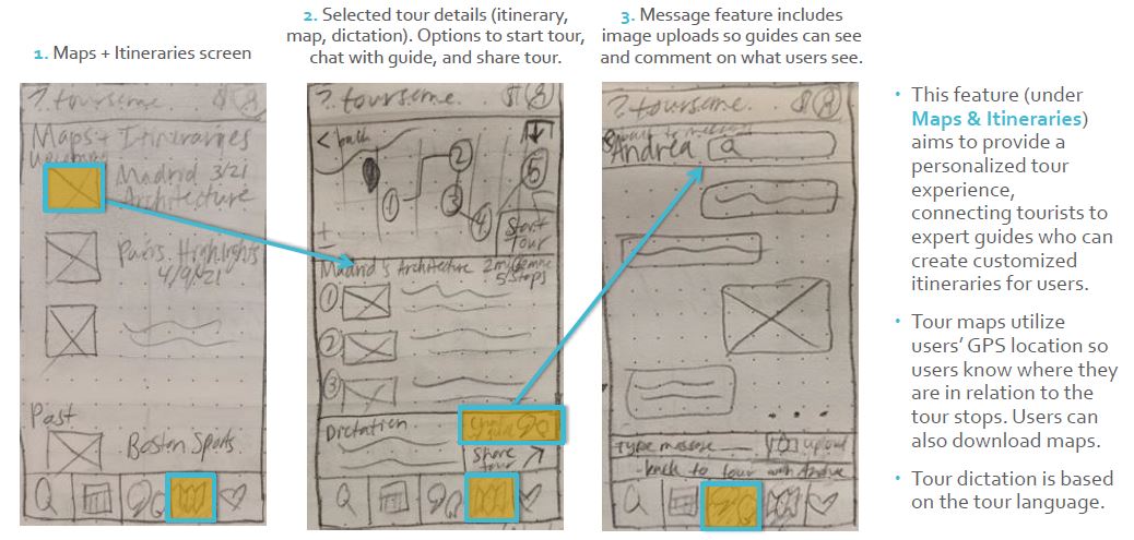
Tour: Create interactive and useful guided tour experience, including itinerary, live map, and dictation
Messaging: Enable users to ask guides questions at any point of the tour
Click to view the live prototype in Adobe XD or watch a video walkthrough with InVision.
Defining the Problem
The Assignment
Assigned to create an app where users contact experts in a given field, I had free rein to choose the concept, features, and audience. This in itself was a challenge that had been workshopped several times, but with my love of travel (halted during the pandemic) and learning through exploration, it clicked to turn this idea into an app for guided tours, where users could contact expert guides for personalized remote tours.
Competitive Analysis
With this idea in mind, I wanted to see what kinds of apps were already in the market on the subject of guided tours to inform my understanding of the audience and features needed during their travels. I conducted a competitive analysis of the travel app PocketSights to see what they offered.
Research
User Interviews
Next, I needed to determine who my audience was and what they wanted to accomplish with toursome. I interviewed 5 potential users who frequently traveled and found common behaviors and themes, which I then synthesized in an affinity map.
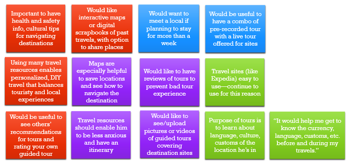

- learn about topics of interest by searching for tours tailored to those topics
- choose virtual tour guides that meet their personal criteria when they schedule a tour
- share pictures/videos and see what their stops are through visual maps and uploads
- view and submit reviews of tours and virtual guides on a testimonial page with 5-star ratings
Personas
After undertaking user research in the form of competitive analysis and interviews to understand the motivations and pain points of potential users, I found 3 distinct user personas: long-term travelers (Marty the month-to-month), short-term travelers (Wanda the weekender), and Tina (the transplant). From here I defined their behaviors and journey maps.

Occupation: English teacher
Marty (the month-to-month) persona represents long-term travelers who seek tours that meet their budget and interests.
A lover of languages and culture, Marty resides in Madrid during the summer months to teach English to students. During his free time, he enjoys exploring Spain by foot and train, learning about history, art, and food from guided tours and locals. He is more of a tactile traveler and carries bilingual resources with him. He doesn’t use social media, but he does write a travel blog about his excursions.
Wanda (the weekender) persona represents short-term travelers who seek tours that cover main attractions and fit their schedules.
Based in Melbourne, Australia, Wanda is a flight attendant who travels each month to cities and countries around the world. Her working schedule allows for day- to week-long excursions in the locations she flies to, so she aims to use this time seeing the hot spots, going on fun tours, and exploring nature. She’s very active
on social media, often finding recommendations and travel spots right on her phone.

Occupation: flight attendant

Occupation: VP of International Sales at a clothing company
Tina (the transplant) persona represents new residents who seek tours about the customs and cultures of their new homes.
Tina’s job as a VP of Sales at a Tokyo-based clothing company requires her to work between Vancouver, Tokyo, and Bangkok, and other offices around the Asia-Pacific region. A transplant from Toronto, she enjoys being immersed in new cultures and languages, and relies on print guides, local recommendations, and guided tours to navigate new cities.
User Flows
I also created user flows based on a task analysis of each persona’s goals using toursome.

Design
Now that I understood the users’ motivations and challenges, I could then lay the design foundation to help users accomplish their goals. This entailed creating sitemaps, wireframes, and prototypes to establish the information architecture and convey functionality within toursome.
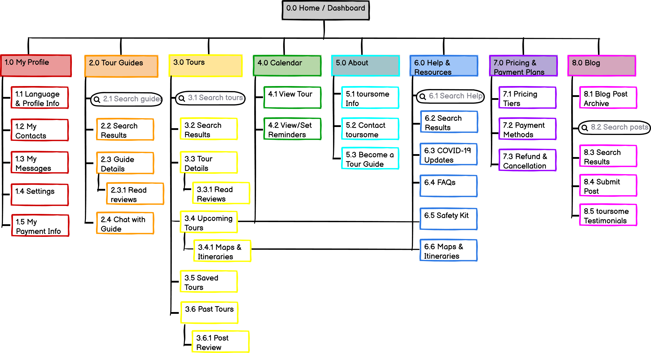
Sitemap
To refine toursome’s information architecture, I launched a remote open card sort using OptimalSort and had participants label categories with content from my original sitemap. With Balsamiq I then created a revised sitemap based on card sort results, all following a hierarchical structure.
Wireframing
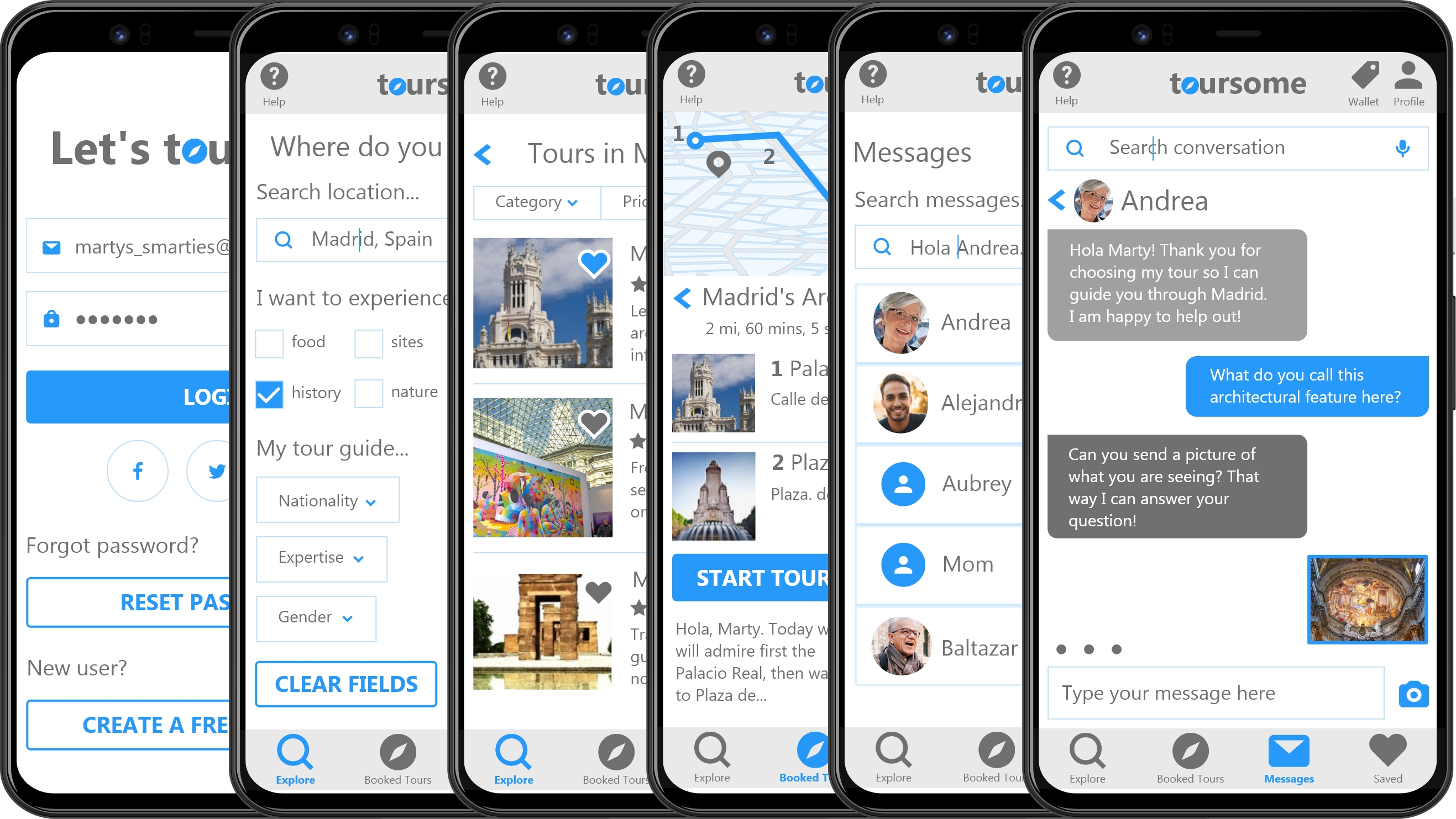
From low-fidelity sketches, mid-fidelity mock-ups in Balsamiq to high-fidelity prototypes in Adobe XD, thinking through each of the 3 features and translating them to a digital interface allowed me to visualize how user flows and a mobile interface work together to create a cohesive user experience.
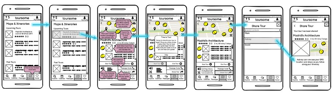
Prototyping
Iterating upon the low- and mid-fidelity wireframes led to creating high-fidelity wireframes and prototypes, which brought my sketched designs to life with color and functionality.

Validate
After bringing toursome‘s 3 main features to life through high-fidelity wireframes and a working prototype, now came the time to validate whether my designs were useful and usable! This entailed usability testing and preference (A/B) testing.
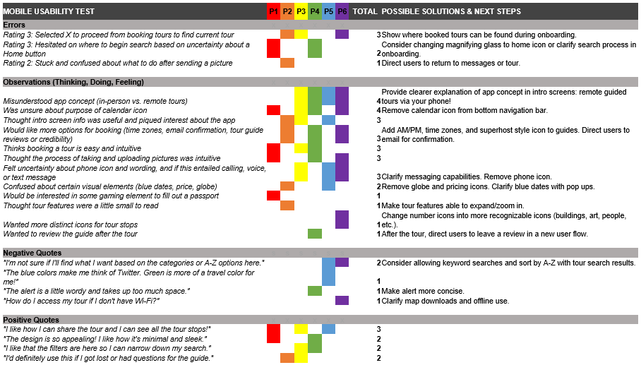
Usability Testing
Via 5 moderated Zoom sessions and 1 in-person session, I recruited 6 testers (between the ages of 24 and 48, half male and half female) to evaluate the toursome prototype with these objectives:
- Evaluate attitudes toward app concept and overall organization: How do they feel about it? Does it make sense? Is there anything missing or unnecessary?
- Have users book a tour: Do they get the search results they want? Are the search criteria helpful or what they’re looking for?
- Look at touring navigation: Can they access their upcoming tours? What are their opinions on dictation and sharing the trip? Is the calendar section necessary?
- Test out messaging: Is it clear what this does? Can they upload pictures? Is there anything missing that they’d like to have here?
- Identify any frustrations and challenges: What errors do they make? Are they able to recover, and how long does it take to do so?
I used Jakob Nielsen’s severity rating scale to quantitatively evaluate errors and compiled a report of qualitative comments to understand the why behind issues testers experienced.
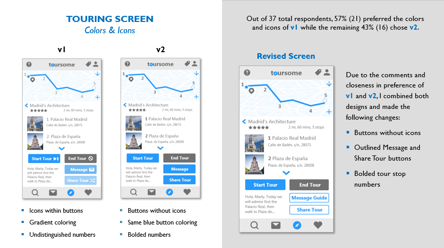
Preference Testing
Usability testing revealed next steps for redesigning the prototype, so I went back to the drawing board to iron out the errors and clear up areas of confusion. After redesigning different versions of the same screens, I wanted to further validate which screens were more user friendly, so I conducted preference tests remotely with UsabilityHub. Between 25 and 37 participants weighed in on the functionality and layout of these redesigned screens for the 3 main features. Further changes were then made to the prototype to improve learnability, navigation, and overall visual layout across toursome.
Refining & Iterating
Design is a continuous and recursive process. Even though I validated my prototype, I still incorporated revisions to make toursome even more useful, usable, and user friendly for everyone.
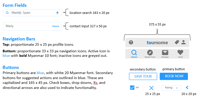
Style Guide
Iterating and redesigning toursome led to the creation of a style guide and design language that encompasses color, typography, images, buttons, and other UI elements to make the experience consistent across screens.
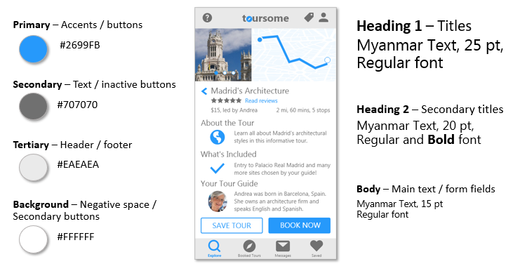

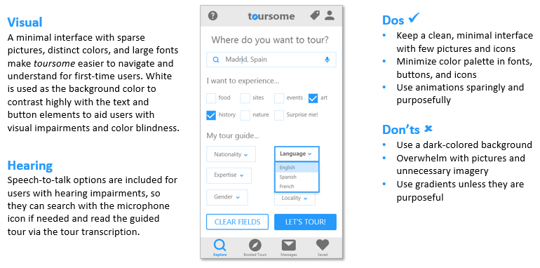
Accessibility
In addition to iterating upon the design for general users, I learned it’s essential to incorporate universal design features like dictation and high color contrast to make the user experience as accessible as possible.
Going Forward
Lessons Learned
In each stage of the design process for toursome I learned about each of the deliverables needed to center the users’ needs (from personas to accessibility accommodations and everything in between), but I also learned from some of the mistakes I made along the way:
- Prioritize in-person usability tests. Usability testing remotely can be a challenge with technical difficulties and lack of reading the users’ body language.
- Grids can completely change the look and feel of the design. Even though the changes can be subtle realignment or resizing of elements, having these elements mapped to a grid makes the layout much cleaner and consistent across screens.
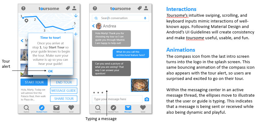
- Android and iPhone users will have different experiences because of their operating systems, but there are design language guides in place that recommend best practices from everything to navigation bars to spacing lists. I consulted Google’s Material Design often for guidance on toursome‘s visual layout.
- Accessibility is key! I had certain accessibility features already in mind when designing toursome (like transcription for hearing-impaired users and speech-to-text for visually impaired users), but I didn’t realize there were so many additional considerations. I resized and bolded fonts and added labels for form fields to make toursome even easier to use.
Next Steps
If I were to continue designing toursome, there are a few aspects I’d like to develop further:

Build out and mock up wireframes for the Saved, Profile, Wallet, and Help menu options.

The current app design is user-facing aimed at tourists, but because there is a secondary group of users being the tour guides, I would like to map out their interface and how their tours would function, conducting interviews with actual tour guides to get a sense of features they need.

Conduct another round of usability testing to see if users have issues, comments, or concerns about toursome‘s current iteration.
